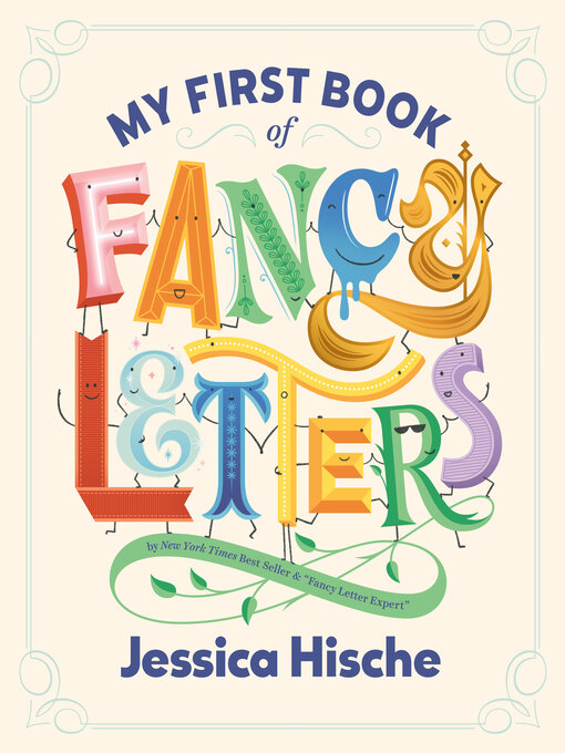
Did you know letters can be ATHLETIC, BUBBLY, or even CREEPY?
Using unique lettering styles to showcase a fun word for each letter of the alphabet, this inventive picture book by creator Jessica Hische highlights how letters can come in all shapes and sizes—and are awesome in their own ways.
Not only conveying the value of differences to little ones but also introducing young readers to some “bigger” words through typography, this book makes a great gift for baby showers, big-kid birthdays, your favorite font-obsessed friend, and more.
-
Creators
-
Publisher
-
Release date
October 22, 2024 -
Formats
-
Kindle Book
-
OverDrive Read
- ISBN: 9780593887097
-
-
Languages
- English
-
Reviews
-
Kirkus
September 15, 2024
Each letter of the alphabet gets fresh and fancy in this primer from typography guru Hische. "Letters can be A-for-Athletic," "J-for-Jeweled," or "U-for-Unique," but one thing's for sure: "Each and every letter is AWESOME!" On each page, lowercase letters are rendered in pastel 3D block lettering, while uppercase counterparts take on stylized typographic pizzazz to match the descriptive text, which features lively adjectives that begin with the corresponding letter. Each anthropomorphized letter has a simple, expressive doodled face and stick limbs. Lowercaseb uses a tiny bubble wand to blow a soapy, uppercase bubblyB. UppercaseM is drawn with curling serifs and a rabbit-filled top hat and a wand, much to the delight of the lowercasem spectator. Each scene is colorfully detailed, though visually a bit flattened by the stark white background. While the design is inspired, however, it isn't clear who this book is intended for. The intricacies of the art may go over the heads of readers learning their ABCs; older children and typography-loving adults, as well as fans of Hische's work, feel like this book's true audience. Those readers may find the presentation and format a bit on the young side, while preschoolers will likely struggle with words such asvibrant, prickly, andelectric. A charmingly illustrated and designed work that will have trouble finding its readership.(Picture book. 3-7)COPYRIGHT(2024) Kirkus Reviews, ALL RIGHTS RESERVED.
-
School Library Journal
November 1, 2024
PreS-Gr 1-Hische, a lettering artist, has paired a descriptive word with her bold and vibrant majuscule letters and simplified miniscule letters, all with simple cartoon faces. This is a book that is meant to be read out loud and shared so listeners can admire the metaphoric drawings of the capitals, the small letter sidekick, and the details included with the drawings-the letter H is red hot puffy letter, the letter I is a block of ice with icicles. Some of the drawings are not as easy to decipher. As an example, the A for athletic appears on a varsity jacket. Another example is Q for Quilt, featuring a letter that is, unfortunately, not round, but a square. VERDICT An additional purchase for schools or libraries needing a read-aloud alphabet book, this is for children who already know their letters.-Vi Ha
Copyright 2024 School Library Journal, LLC Used with permission.
-
subjects
Languages
- English
Loading
Why is availability limited?
×Availability can change throughout the month based on the library's budget. You can still place a hold on the title, and your hold will be automatically filled as soon as the title is available again.
The Kindle Book format for this title is not supported on:
×- - Kindle 1
- - Kindle 2
- - Kindle DX
- - Kindle Keyboard
- - Kindle 4
- - Kindle Touch
- - Kindle 5
- - Kindle Paperwhite
- - Kindle 7
- - Kindle Voyage
Read-along ebook
×The OverDrive Read format of this ebook has professional narration that plays while you read in your browser. Learn more here.


